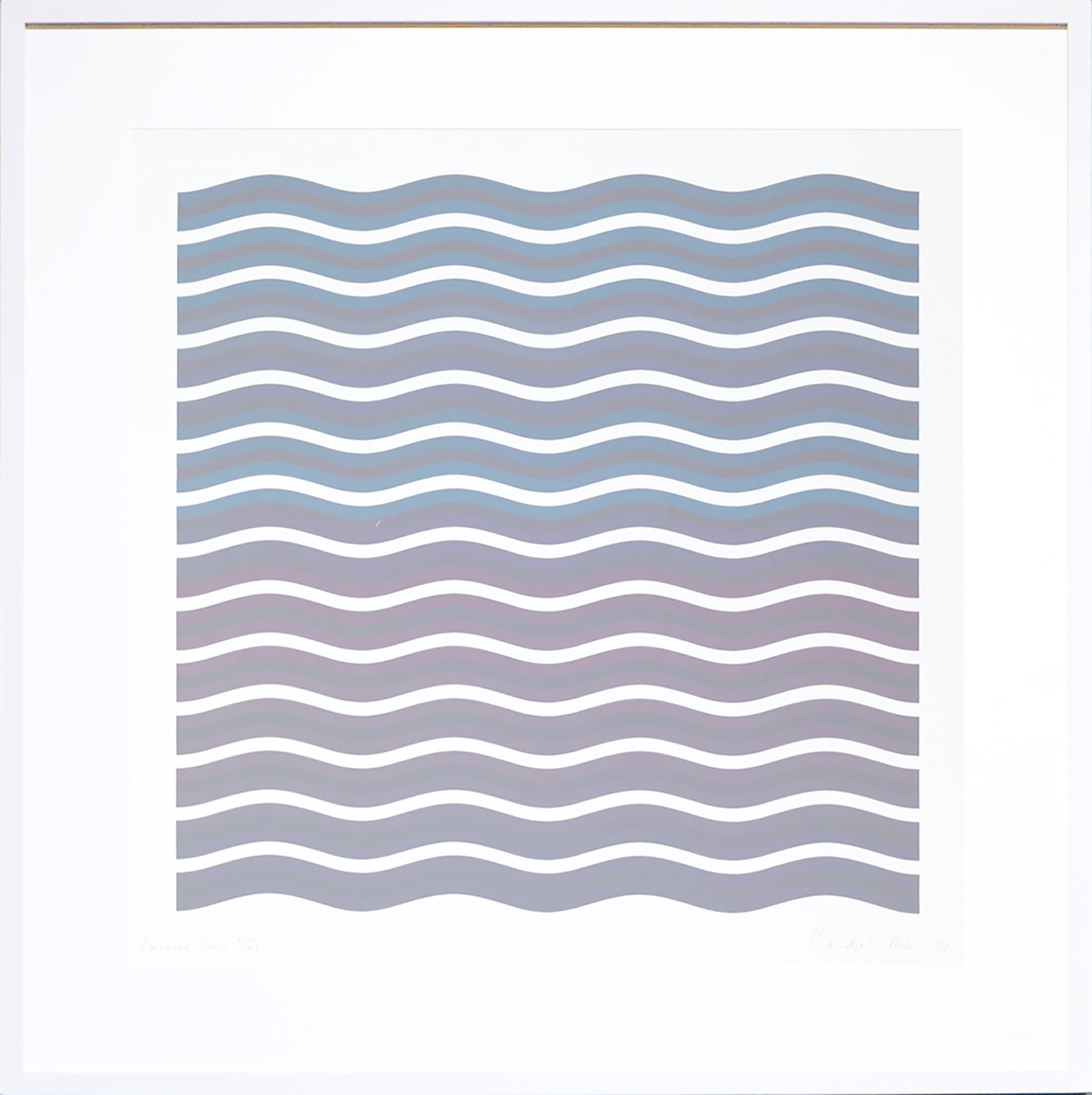
Bridget Riley, Coloured Greys II, 1972
The critic Robert Melville once claimed that ‘no painter, alive or dead, has ever made us more conscious of our eyes than Bridget Riley.’ Her pioneering approach to colour and composition have cemented her status as one of the most important artists of her generation. Although composed in the language of abstraction, they capture eloquently the thrill of being physically present in the world, and the joy of its visual phenomena.
During the past two years we have seen an explosion in demand for Riley’s graphic works. Her market has seen extraordinary growth and her prints are becoming increasingly hard to find. We’re delighted to be able to offer a fabulous selection of works that chart the course of her career and demonstrate vividly why she is one of the most desirable and investible British artists working today.
Any questions? We are happy to help. Call: 0117 279 6402 or send us a message now.
Bridget Riley, Coloured Greys II, 1972
This print stands as a testament to the incredible subtlety of Riley’s creative vision. It was made at a transitional point in her career, when the monochromatic approach she had previously employed was starting to give way to the brilliant palette that would define her later career. The soft undulation of the repeating horizontal bars create the impression of gentle movement, as though the ink were water being caressed by a breeze. The Coloured Greys prints serve as a vivid reminder that for all its seemingly abstract qualities, Riley’s work is firmly rooted in the tangible experience of the natural world.
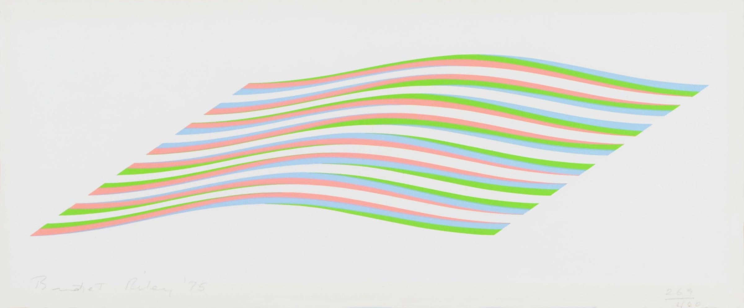
Bridget Riley, Wave, 1975
Riley's graphic work had begun to incorporate the wave motif in 1972; it would reappear periodically until 1978. This jewel-like example from 1975 was published by the Galerie Beyer in Basel to accompany an exhibition of Riley's work. Despite being a non-representational image, the softly undulating wave was inspired by her time spent in Cornwall as an evacuee during the Second World War. Perhaps the most intimate of the 'Wave' artworks, the artist chooses to isolate a fragment of the rhythm rather than allowing it to be subsumed into a larger whole, as was her usual process at the time. A gorgeous work that whispers like a summer breeze, it represents Riley at her most eloquent.
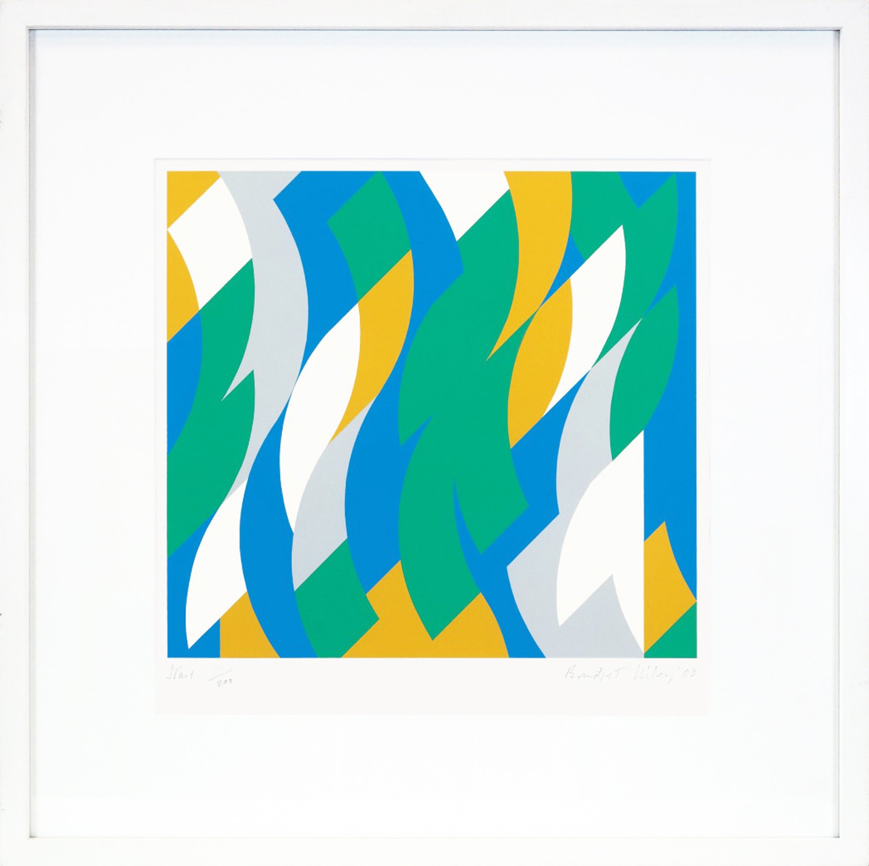
Bridget Riley, Start, 2000
In 1997 Riley began to introduce a curvilinear element to her work, a theme that took a further two years to fully develop. The resulting images express a sense of raucous movement and rhythm. The momentum that this unleashed might have threatened to become uncontrollable had Riley not sought to slow the pictures down to a more stately pace by expanding both the scale and volume of the motif. In prints such as 'Start' the artist gives the energy and jubilation of the original idea free rein. They represent a small, contained fragment of the wild.
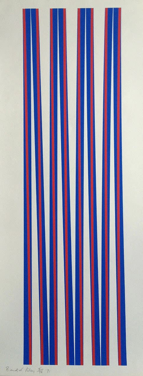
Bridget Riley, Elongated Triangles 1, 1971
In its dizzy sense of movement and chromatic brilliance, the Elongated Triangles series is quintessential Riley. As only the second print she ever made in colour, this piece occupies a very special place within her career. Intricately calibrated and thrilling in its simplicity, it’s a concentrated burst of energy that adds drama to any room.
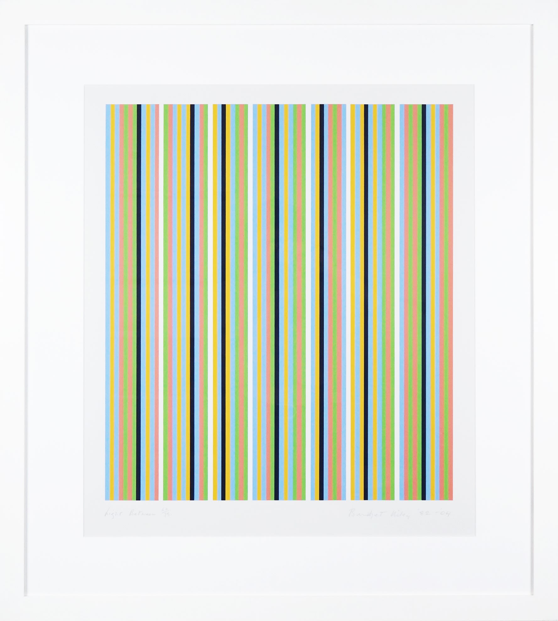
Bridget Riley, Light Between, 1982-2004
This luminous screenprint is a wonderful example of the "Egyptian Palette" that came to define Riley's work after a visit in 1979-80. Referencing ancient tomb paintings and the local landscape, it represented a bolder approach to colour than she had previously explored and was a stepping-stone to the increasingly exuberant palette that she would develop during the 1980s. Rather than copying exactly the colours she had encountered in Egypt, she worked from memory, basing the work upon sensation and feeling. By embracing the simplicity of the vertical stripe, Riley allowed the work to become a purely visual experience. There is a nonlinear aspect to her approach, and earlier methods of working are often revisited years later. Although printed in 2004, “Light Between” is also dated ‘1982’ to emphasise the profound connection it shares with the paintings made that year.
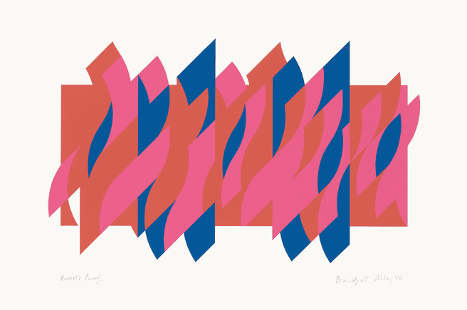
Bridget Riley, Red Red Blue, 2010
A vivid example of Riley’s determination to harness “the music of colour”, this exuberant composition also illustrates the importance of the white, unprinted paper in her graphic work. As in the smaller print “Start”, the curvilinear motif that defines the work of this period is given the freedom to run riot. Here it overwhelms the bounds of the image and continues its music with joyous abandon.
Any questions? We are happy to help. Call: 0117 279 6402 or send us a message now.
